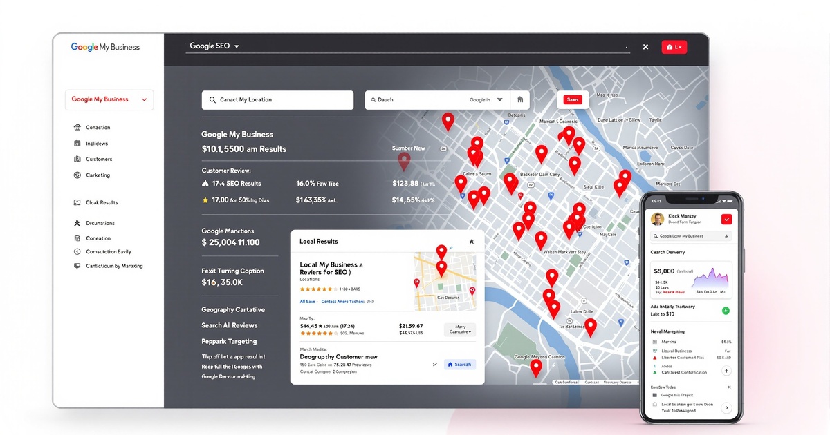
Google's mobile-first indexing is now the standard for all websites. With 78% of organic search traffic coming from mobile devices, and Google exclusively using mobile content for indexing and ranking, mobile optimization is no longer optional—it's mandatory. Understanding Mobile-First Indexing - Mobile-first indexing means Google predominantly uses the mobile version of your content for: Indexing new pages. Ranking in search results. Generating snippets. Understanding site structure. Evaluating page quality. Determining mobile-friendliness. Assessing user experience. If your mobile site is inferior to desktop, you will lose rankings even for desktop searches. Core Web Vitals for Mobile - Core Web Vitals are critical mobile ranking factors: Largest Contentful Paint (LCP) must be under 2.5 seconds measuring when the largest content element becomes visible. Interaction to Next Paint (INP) must be under 200ms measuring time from user interaction to visual response. Cumulative Layout Shift (CLS) must be under 0.1 measuring unexpected layout shifts. To optimize: Optimize and compress images. Minimize render-blocking JavaScript and CSS. Implement lazy loading. Use content delivery networks (CDNs). Leverage browser caching. Minimize third-party scripts. Optimize server response times. Responsive Design Best Practices - Responsive design ensures optimal experience across all devices: Use flexible, fluid grid layouts. Implement CSS media queries for breakpoints. Design mobile-first, then scale up to desktop. Ensure touch targets are minimum 48x48 pixels. Use viewport meta tag properly. Avoid fixed-width elements. Test on real devices, not just emulators. Consider different screen sizes and orientations. Optimize navigation for mobile users. Use mobile-friendly forms. Mobile Page Speed Optimization - Speed is critical for mobile users and rankings: Compress and optimize all images (WebP format preferred). Minimize HTTP requests. Enable Gzip compression. Minify CSS, JavaScript, and HTML. Eliminate render-blocking resources. Use asynchronous loading for JavaScript. Implement critical CSS inline. Lazy load images and videos. Reduce server response time to under 200ms. Use a content delivery network. Remove unused code and resources. Mobile Content Optimization - Mobile content strategy differs from desktop: Write shorter paragraphs (2-3 sentences maximum). Use bullet points and lists for scannability. Implement collapsible sections for long content. Front-load important information. Use larger font sizes (minimum 16px). Ensure adequate spacing between elements. Make headlines clear and compelling. Avoid pop-ups that interfere with content. Use mobile-optimized images and videos. Implement tap-to-call for phone numbers. Mobile Navigation and User Experience - Mobile navigation must be intuitive and efficient: Implement hamburger or bottom navigation menus. Use breadcrumbs for easy navigation. Ensure search functionality is prominent. Create clear, tappable buttons and links. Minimize form fields and steps. Use autofill and autocomplete. Implement sticky headers or footers strategically. Create mobile-specific landing pages. Test user flows on mobile devices. Optimize checkout process for mobile. Mobile-Friendly Forms - Forms must be optimized for mobile users: Use appropriate input types (tel, email, date). Minimize required fields. Use large, tappable form elements. Provide clear error messages. Implement inline validation. Use autofill attributes. Create multi-step forms for complex processes. Display progress indicators. Avoid CAPTCHAs when possible. Optimize submit buttons for mobile. Mobile Video Optimization - Video content must perform well on mobile: Use mobile-responsive video players. Implement thumbnail images for lazy loading. Provide captions and transcripts. Optimize video file sizes. Use adaptive bitrate streaming. Ensure videos don't autoplay with sound. Position videos appropriately for mobile viewing. Make video controls touch-friendly. Test video playback on mobile networks. Provide fallback for unsupported formats. Mobile Local SEO - Local businesses must optimize for mobile local search: Optimize Google Business Profile for mobile users. Ensure NAP is consistent and prominent. Implement click-to-call phone numbers. Use Google Maps integration. Optimize for near me searches. Create mobile-friendly location pages. Display hours prominently. Make directions easy to access. Optimize for voice search queries. Implement local schema markup. Mobile Technical SEO - Technical optimization ensures mobile crawlability and indexing: Use rel=canonical properly. Avoid mobile subdomain or separate URLs if possible (responsive is best). Ensure resources are not blocked in robots.txt. Implement structured data on mobile. Use hreflang tags correctly if serving different content by location. Ensure mobile sitemap is submitted. Avoid intrusive interstitials. Implement AMP only if beneficial. Test mobile rendering with Google Search Console. Monitor mobile usability errors. Mobile Testing and Monitoring - Regular testing ensures ongoing mobile performance: Use Google Mobile-Friendly Test tool. Monitor Mobile Usability report in Search Console. Test on multiple real devices and browsers. Use Google PageSpeed Insights. Analyze Core Web Vitals report. Test on slow mobile networks. Review mobile analytics and behavior. Conduct user testing on mobile. Monitor mobile conversion rates. Test mobile checkout and form completion. Progressive Web Apps (PWAs) - PWAs provide app-like mobile experiences: Implement service workers for offline functionality. Add web app manifest. Enable add to home screen. Provide push notifications. Ensure fast, reliable loading. Create app-like navigation. Implement background sync. Cache content for offline access. Provide installation prompts. Common Mobile SEO Mistakes - Avoid these mobile optimization pitfalls: Blocking CSS, JavaScript, or images on mobile. Using Flash or unsupported technologies. Implementing intrusive pop-ups. Having different content on mobile vs. desktop. Slow mobile page speed. Tiny text and unreadable fonts. Unplayable video or audio. Faulty redirects. Non-responsive design. Poor mobile navigation. Mobile-First SEO Checklist - Implement responsive design. Optimize Core Web Vitals. Compress and optimize images. Minify CSS and JavaScript. Enable browser caching. Implement lazy loading. Optimize mobile navigation. Create mobile-friendly forms. Ensure fast page speed. Test on real mobile devices. Monitor Mobile Usability report. Optimize local mobile search. Implement click-to-call. Test mobile checkout process. Analyze mobile analytics. Results Timeline - Week 1-2: Technical mobile optimizations implemented. Month 1: Core Web Vitals improvements. Month 2-3: Mobile rankings improvement. Month 3-6: Increased mobile traffic and conversions. Month 6-12: Mobile-optimized site driving significant traffic and revenue. Mobile-first indexing is the reality of modern SEO. Websites that prioritize mobile user experience and technical performance will dominate search results.
Admin
Digital Marketing Expert
Part of the expert team at Wisdek Digital Marketing, delivering results-driven strategies for businesses across Canada.